The Insights dashboards are dynamic and interactive, allowing you to drill down into specific details. This guide covers common actions available across all dashboards, including filtering, viewing details, and exporting data.
 NOTE: For a list of available dashboards and instructions to access them, see Insights Dashboards Master List [Guides List].
In this article, datasets refer to charts, maps, tables, and tiles. All screenshots are for illustrative purposes only.
This article is divided into the following sections:
- Filtering Data
- Viewing Details
- Understanding Chart Elements
- Interacting with Charts
- Exporting Data
I. FILTERING DATA
You can filter dashboard data on-the-fly to focus on specific details.
NOTE: Depending on the amount of data, applying some filters may take a few moments to process.
There are two ways to filter:

A. Using embedded filters: Use the dropdowns, calendars, and other controls embedded in the dashboard to refine the displayed data.
NOTE: Available embedded filters vary by dashboard.
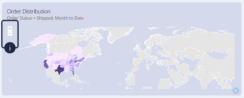
B. Clicking on a data representation: Click a country on the map or a bar in a chart to add that subset to the filters already applied across all applicable datasets.
For example, clicking the Canada Post bar in the Packages by Carrier chart will update all datasets in the dashboard to display data related to Canada Post.
To remove a filter, click its strikethrough filter icon.

To see which filters are applied to a dataset, hover over its filter icon.

II. VIEWING DETAILS
i. Understanding Chart Elements
In some charts, a red diamond marker shows the average value, which is useful for comparisons.

Similarly, other charts may use dashed lines to represent the minimum, maximum, and average values, providing context for the main data points.

ii. Interacting with Charts
When more information is available for a dataset, an expand icon appears when you hover over it. Click it to open a pop-up with additional details.

NOTE: Applied filters remain active in the details view.
You can also hover over specific chart elements, such as a bar, to display a tooltip with details for that specific item. The content of the tooltip varies depending on the chart.

Some datasets may also feature sort control buttons. Clicking the sort button cycles through the available sorting states:
| SORT BY | ORDER | ICON |
| Horizontal Axis (X-axis) | Ascending |  |
| Descending |  | |
| Remove Sort |  | |
| Vertical Axis (Y-axis) | Descending |  |
| Ascending |  | |

For trend charts and map visualizations, zoom control buttons may be available. Zooming in on the timeline can reveal a future trend forecast based on historical data.

Zooming in on maps allows for easier navigation and drill-down into smaller regions, such as states or provinces, if supported.
You can switch between graphical and table views by clicking the table icon.

NOTE: When viewing data in a table format, if a specific value is unavailable (such as a date that has not occurred yet), the corresponding cell will remain blank.
III. EXPORTING DATA
When available, you can export a dataset by clicking the export icon that appears when you hover over it.

The pop-up menu lets you choose from the available formats, including a print option.

NOTE: Exported data respects all applied filters.
Was this article helpful?
That’s Great!
Thank you for your feedback
Sorry! We couldn't be helpful
Thank you for your feedback
Feedback sent
We appreciate your effort and will try to fix the article