The techSHIP User Interface (UI) has been completely redesigned to maximize intuitiveness, navigation and space optimization.
The UI follows the same guidelines as other Techdinamics' products, ensuring a smoother learning curve and offering a unified experience.
This article guides you through the application-wide key features. It is divided into the following sections:
- Sections
- Header
- Main Menu
- Main Content
- Footer
- General Records
- Specific Entries
 NOTE: Screenshots are used for illustrative purposes as examples.
Learn about contextual help UI elements in the Contextual Help (In-Place Articles & Tooltips) in techSHIP [Guide].
For personalized AI-powered assistance and direct access to support resources, see: Introducing the Techdinamics Assistant in techSHIP [Guide].
NOTE: For a full overview of all new features, see: What's New in techSHIP: A Guide to the Latest Features [Information].
I. SECTIONS
i. Header

The header section is located at the top. Use it to manage top-level behavior, such as displaying the main menu, switching portals, changing the selected printer or language, checking announcements, and managing the logged-in user account:
A. Menu button: Displays or hides the main menu.
B. Portal switcher: Switch between portals, which are listed in a Company Name - Portal Name format.
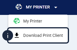
C. Printer selector: Switch between printers, check their status, and download the print client application. The currently selected printer is always displayed in the header:
| SELECTION STATUS | PRINTER STATUS | DISPLAY IN UI |
Selected (in header) | Active |  |
| Inactive |  | |
Unselected (in dropdown) | Active |  |
| Inactive |  |
Additionally, you can download the installation file for your workstation directly from this menu. Click the Download Print Client link located at the bottom of the dropdown list.
D. Logged in user management: Access the logged-in user profile to manage your account and security settings. Clicking this option opens a dropdown menu with the following actions:
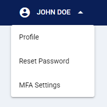
- Profile: View your account settings and manage your API key.
- Reset Password: Trigger a password reset request.
- MFA Settings: Enable or disable Multi-Factor Authentication (MFA). This adds an extra layer of security by requiring a generated code from an authenticator app.
E. Language selector: Switch between available languages.
F. Announcements: Displays or hides a pop-up menu with the latest updates and new features.
G. Log out button.
ii. Main Menu

The main menu has two main components, as detailed below:
A. Categories: Collapses or expands available menu items within that category.
B. Menu items: Opens the item's specific page.
NOTE: Since new functionalities are introduced regularly, menu items are updated frequently. For details on the latest menu content, see Understanding the New Menu Structure in techSHIP [Guide].
iii. Main Content

This is the main content area. It displays the selected menu item details and allows you to perform actions on it.
The main content layout depends on whether you're viewing a list or editing a single entry. This is illustrated in the following sections.
iv. Footer

Located at the bottom, the footer provides legal information and a Feedback button to submit suggestions:
A. Copyright: Displays copyright information.
B. Privacy: Links to the current Privacy Policy.
C. Terms: Links to the current Terms of Service.
D. Powered: Displays the platform provider (Techdinamics) and the current application version.
E. Feedback: Opens the feedback platform to submit suggestions.
II. GENERAL RECORDS
This view is commonly used when the main content includes many records, typically after selecting a main menu item.

A. Search components: Quickly find entries using the search bar, or click on the filter icon to open advanced filters and search entries based on their properties.
B. Action buttons: Add entries or use available buttons to perform bulk actions. Click on the help button to open the in-place article.
C. Entries: Displays available entries in a table format. Usually, action icons for each entry are available in the last column.
III. SPECIFIC ENTRIES
This view is commonly displayed when editing a specific entry (which usually happens when clicking the settings icon on a General Record view). Its available UI elements are highly dynamic: these are displayed depending on the content (thus, not always all the listed elements are available).

A. Breadcrumb: Displays your navigation path, from the General Records page to the current entry.
This is useful when navigating deeply nested settings, allowing you to move between levels or switch entries efficiently. For example: If you are editing a Billing Account and you need to go back to its Client page, click on its name to return to that section.

B. Actions: Perform actions on the current entry, or click on the help button to open the in-place article.
NOTE: While working on a specific entry, you may see visual indicators (eye or pencil icons) if other users are accessing the same record. Learn more about these indicators in Managing Simultaneous Edits in techSHIP [Guide].
C. Main Properties: Displays the entry's main properties.
D. Tabs: Displays available tabs and their content. If the tab content has many records (as in the screenshot example), they are displayed as detailed in the previous section.
Was this article helpful?
That’s Great!
Thank you for your feedback
Sorry! We couldn't be helpful
Thank you for your feedback
Feedback sent
We appreciate your effort and will try to fix the article